St Catherines Hospice Website Concept
Date
October 12, 2016
Category
Web DesignSt Catherine’s Hospice Website Concept
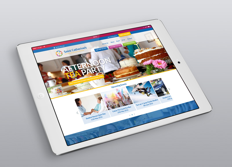
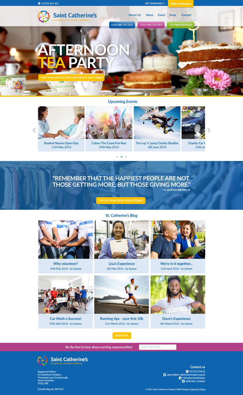
As part of the St Catherine’s hospice branding overhaul we were tasked with designing a concept for a brand new website which would take the charity to the next level. The brief was quite tight, and there was a real need to create a site that would inspire, and keep spirits high when visited.
As part of their new design, the charity wanted to immediately push their services towards 3 core groups, Individuals, volounteers & professionals. We approached this by creating some colour coded navigation elements within the header, which would direct the visitor to the section of the site that they needed, in an efficient way.
In brief, we created a modern, on brand and visually stimulating concept which fitted the requirements very well.


