The Plough
Brand design for this wonderfully renovated village pub
Date
October 12, 2016
Category
Branding, Digital Printing, Graphic Design, Signage & DisplayThe Plough
When we first visited The Plough, it had been reduced to an empty shell for the refurbishment, similarly we were given a completely ‘blank slate’ to work with to develop their new branding. In conjunction with the marketing team we worked to place The Plough as THE pre-eminent boutique hotel/restaurant experience in the Scarborough area.
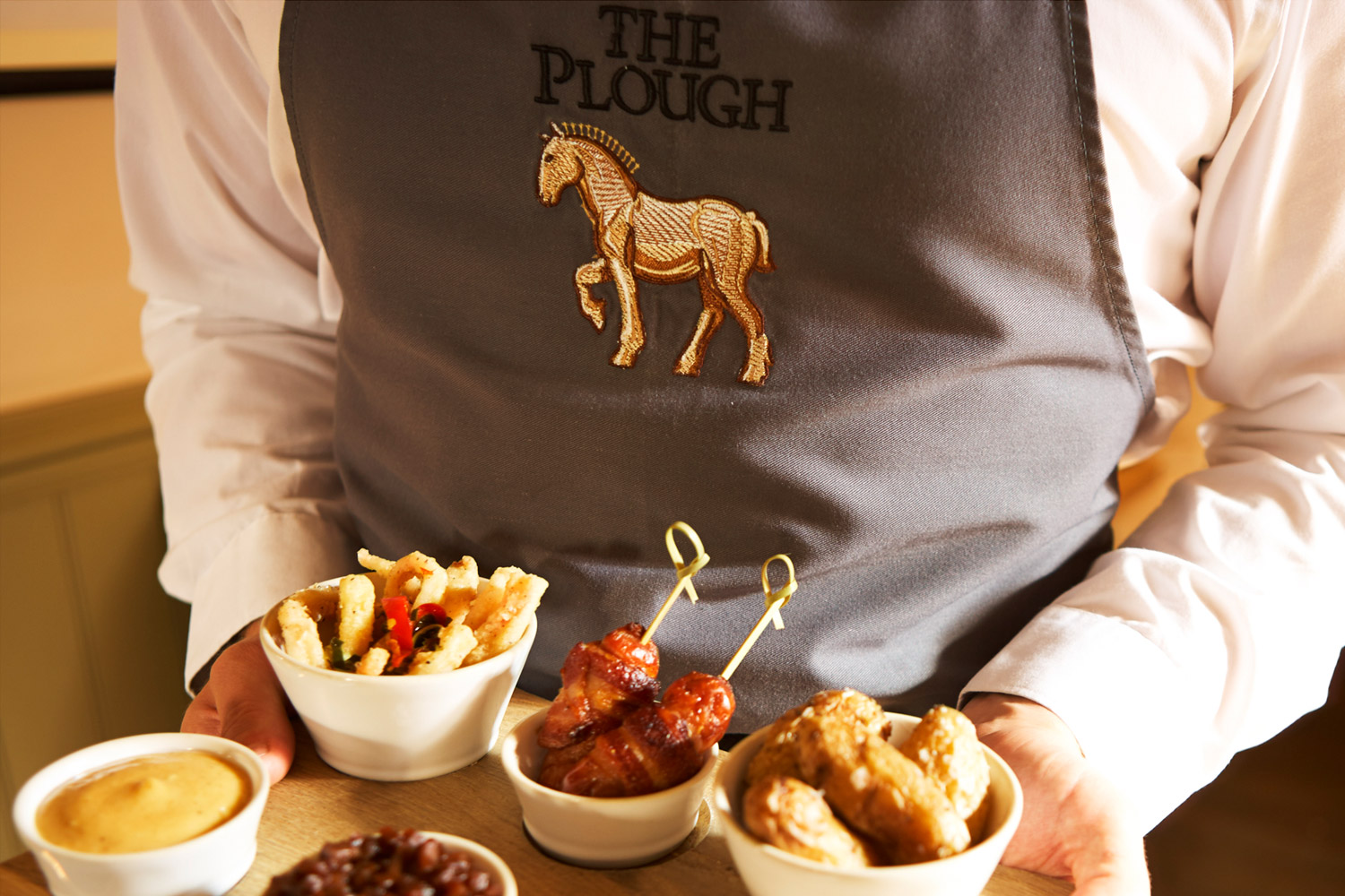
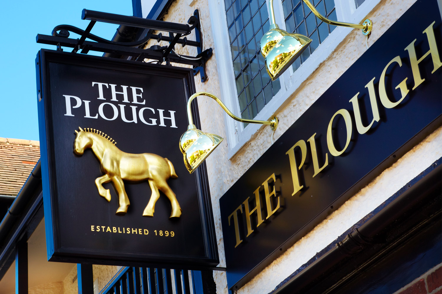
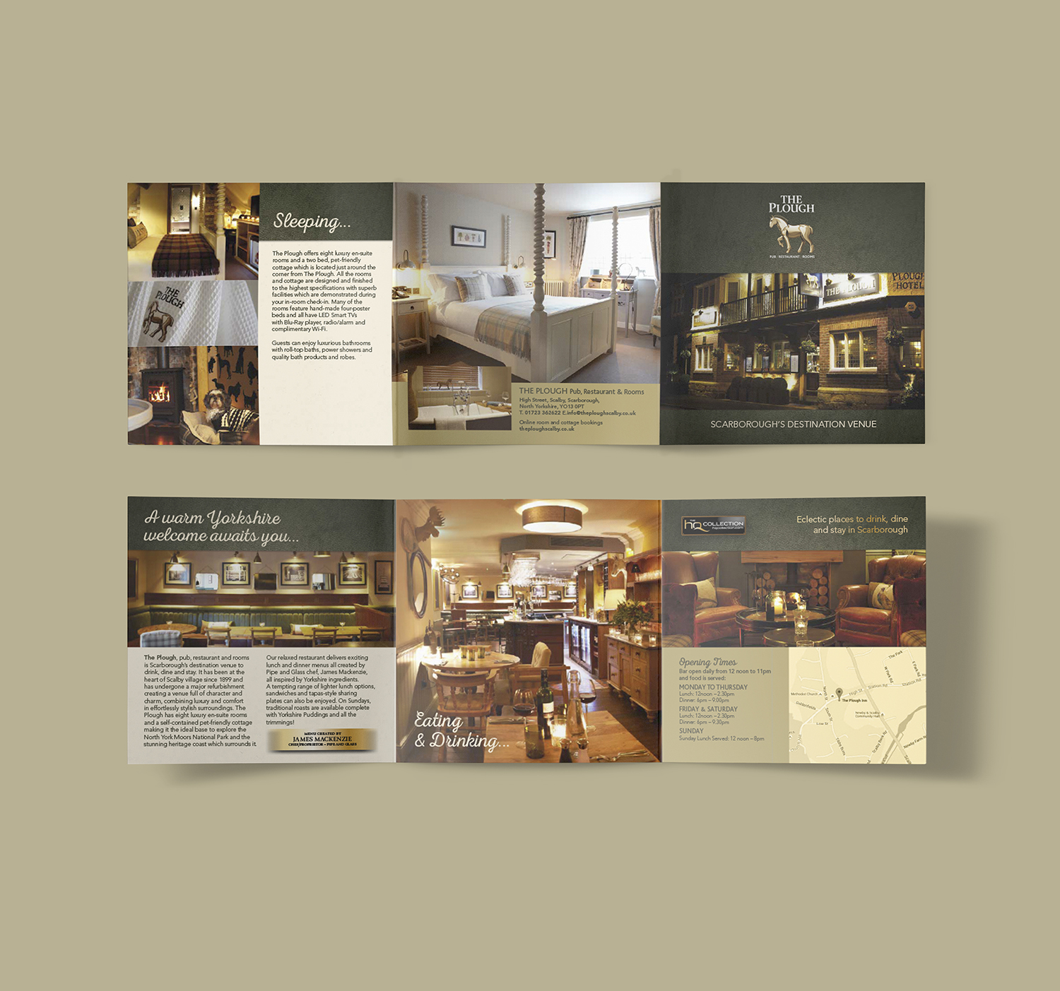
For the logo the humble shire horse was realised as a golden icon (eventually reproduced in three-dimensions and gold leaf on the signage no less!) and this, paired with striking photography, strong typography and a rich, earthy colour palette was eventually rolled-out across a full range of media.
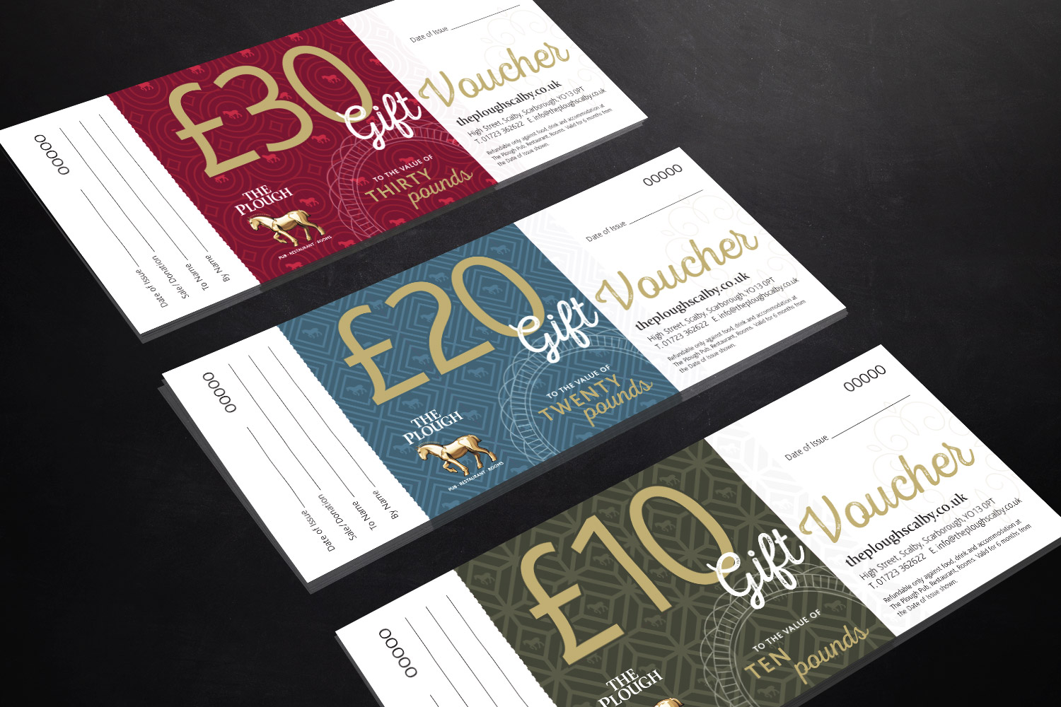
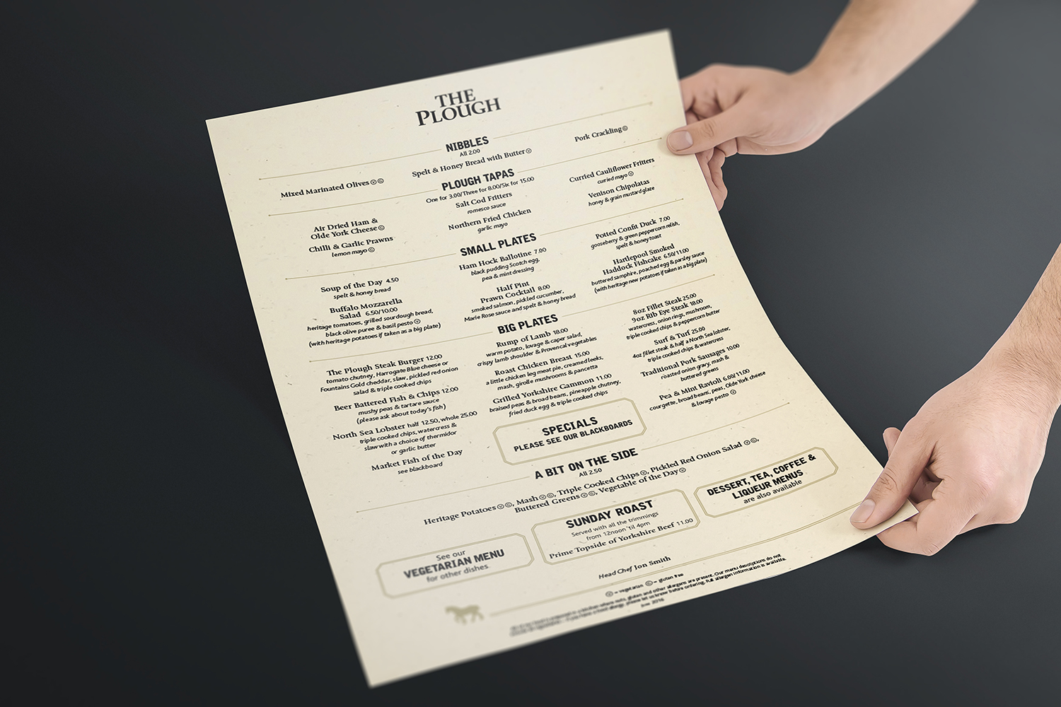
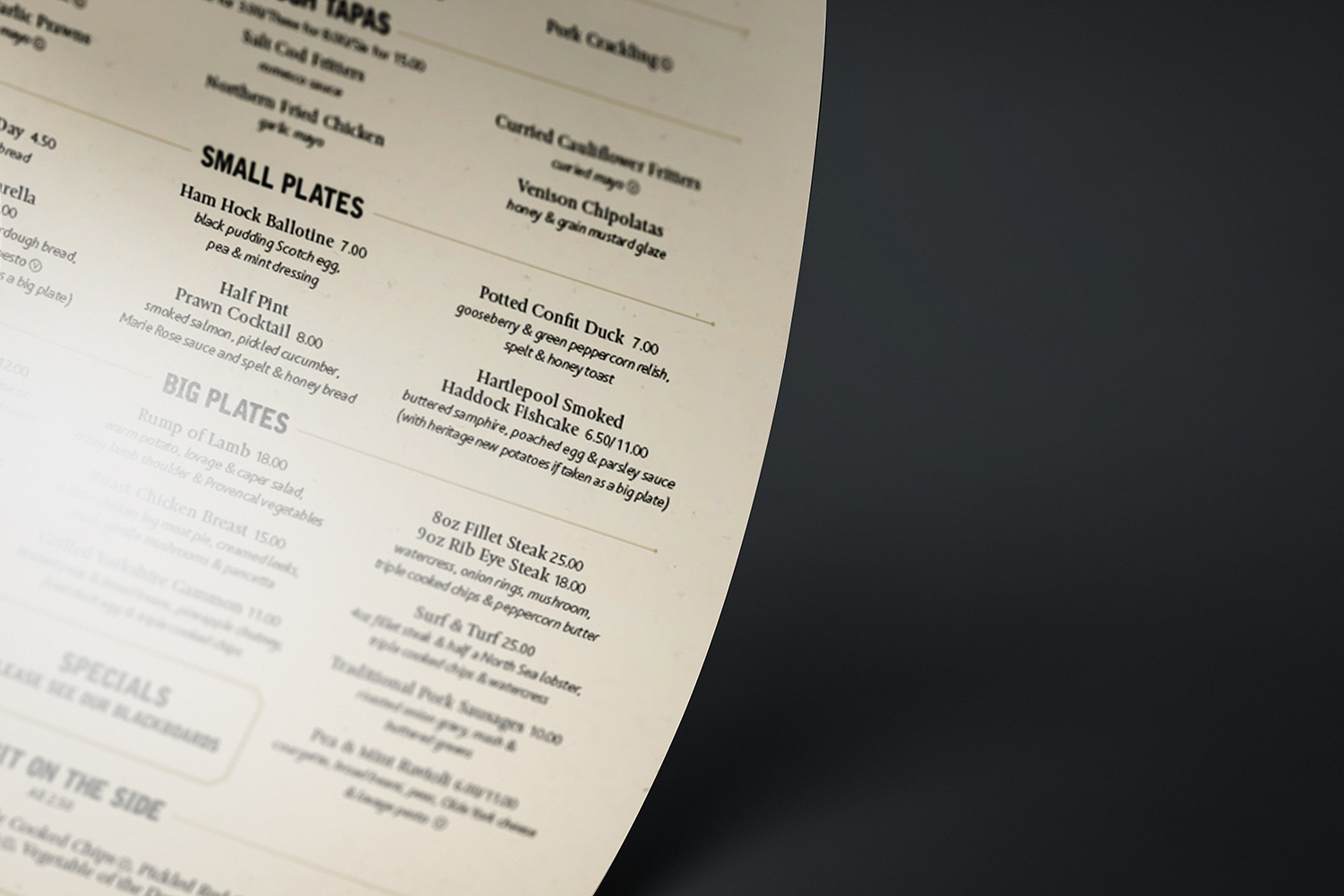
Utilising the full breadth of our services we produced leaflets, postcards, menus, table talkers, branded key fobs, exterior signage, stationery, business cards, internal signage including way-finding graphics, custom printed wallpaper, wall plaques, email campaigns and the website design.


